Changelog
📅 Date: 01.05.2024
🎉 What’s new:
1️⃣ AI Content generation feature
- Users can generate content for an entire page or for a single component.
- To generate content using AI, users need to provide a context description for the page or business. Based on this, the AI will generate the content for the page.
- Users can specify the target language in which the content will be generated.
- Each generated content can be refined using predefined options such as improving writing, fixing grammar, making the content longer or shorter, adding emojis, or translating it into the selected language.
- The generated content is fully editable, allowing users to adapt and modify it according to their needs.
📅 Date: 08.04.2024
🎉 What’s new:
1️⃣ Duplicating pages as new subpages
- Users can duplicate entire pages with all their content
- In order to duplicate page you need to go to pages tab in editor view and then hover over the page item you want to duplicate and click “copy” icon
- During creating copy of the page you need to pass the name of the new page and path to it
2️⃣ Text alignment in WYSIWYG editor
- Each rich text editor inside the component gets new option to align text
- There are four alignments options: left, center, right and justify
- Additionally there is option to reset to default - it sets the initial state of the alignment of the component which is proposed by creators
📅 Date: 03.04.2024
🎉 What’s new:
1️⃣ Scalable workspace
- The workspace now dynamically adjusts to provide a seamless editing experience across different screen types.
- Earlier, the sidebar of the editor was overlapping the workspace area of the page, making it difficult to see the preview of the elements being edited that were underneath. It was necessary to hide the sidebar in order to view the changes. Now, the workspace adjusts to the available space and scales while maintaining the selected screen type (desktop, tablet, mobile).
📅 Date: 02.04.2024
🎉 What’s new:
1️⃣ Drag & drop
- Easily add new components and reorder items with a simple drag & drop interface
- Each component inside the editor is draggable
📅 Date: 27.03.2024
🎉 What’s new:
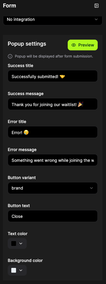
1️⃣ Added possibility to configure form submission popup
- Each component with form has configurable popup
- Within popup configuration you are allowed to change success & error title and messages, button variant and button text and colour of text and background
📅 Date: 25.03.2024
🎉 What’s new:
1️⃣ Added possibility to remove asset
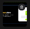
- can be deleted by “trash” icon in right upper corner of thumbnail in asset selector
- it deletes from all the places (e.g. when asset is used in 4 components, after this action it will be deleted from all these places)
🐛 Bug fixes:
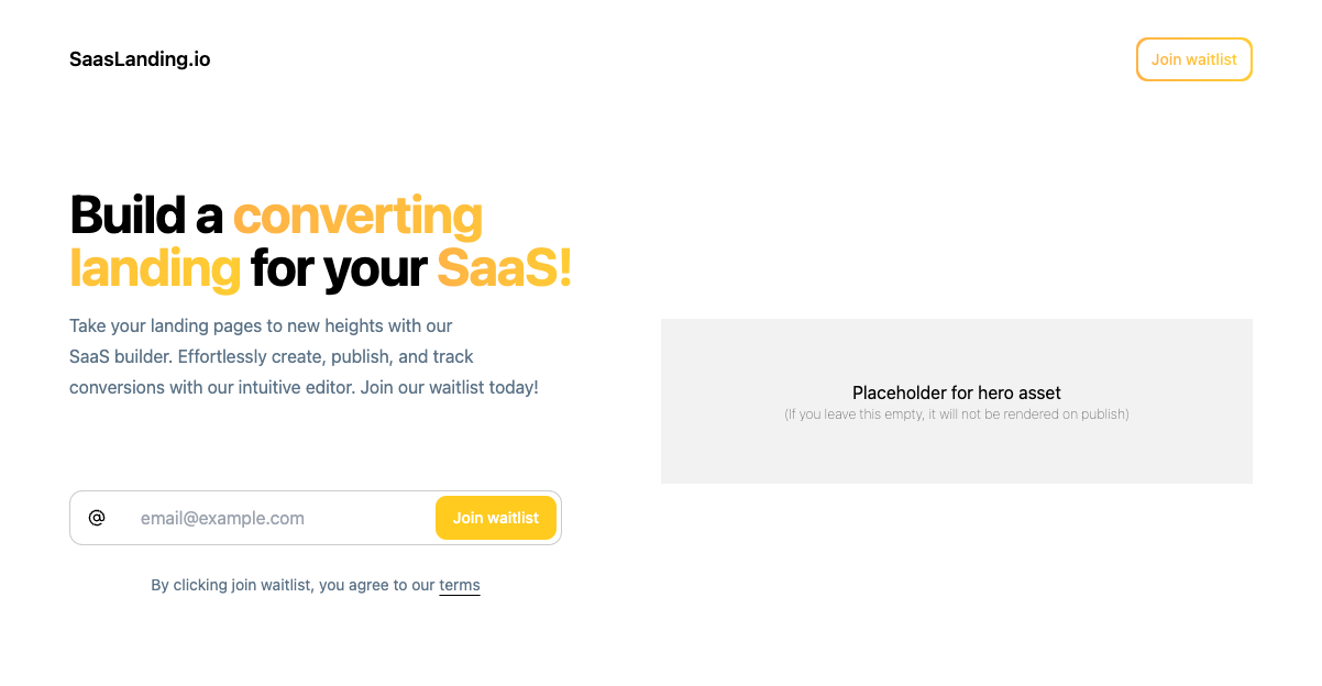
✅ Fixed bug with adding asset in header component when user removed the previous one. From now when no asset is selected, the placeholder for this asset is displayed.
📅 Date: 21.03.2024
🎉 What’s new:
1️⃣ Added site setting allowing to hide SaasLanding badge

🐛 Bug fixes:
✅ Fixed attaching assets over 1 MB - increased to 5 MB
📅 Date: 21.03.2024
🐛 Bug fixes:
✅ Fixed attaching custom domains
📅 Date: 20.03.2024
🎉 What’s new:
1️⃣ Auto save feature introduced in editor
- auto save is enabled by default
- user can opt out of the feature setting as disabled
2️⃣ Added a feedback / suggestion / help / feature request button
- button is displayed in the left bottom corner inside the app and can be used by users to provide feedback, ask some questions, feature request etc
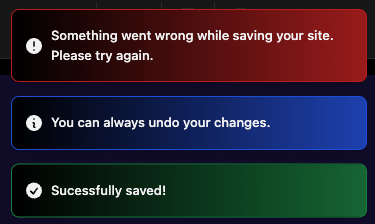
3️⃣ New toasts design introduced
- E.g. when save or publish button is pressed in editor or when feedback is provided
4️⃣ Lucide icons library was updated to newest version
- new icons can be used in components (e.g. in pricing component)
📅 Date: 18.03.2024
🎉 What’s new:
1️⃣ Added customisation of the palette
- When you want to modify the colour of a predefined palette, the system will suggest creating a custom one based on the selected palette
- It is possible to press the "+" button and select the palette on the basis of which to create a custom palette in order not to start from scratch
- Each colour of the palette can be edited using the colour picker
- You can choose a gradient from the predefined gradients or compose your own by pasting it into the text field
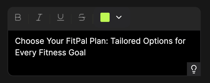
2️⃣ Added fixed toolbar to text component
- toolbar is used to text formatting like setting colour, bold, underline or e.g. attaching link to some phrase
🐛 Bug fixes:
✅ Fixed not saving the status after changing the palette, adding/deleting a new subpage. The only way previously was to press the ‘Save’ button. From now on, this is done automatically.
✅ Fixed not rendering video in notion component
📅 Date: 15.03.2024
🎉 What’s new:
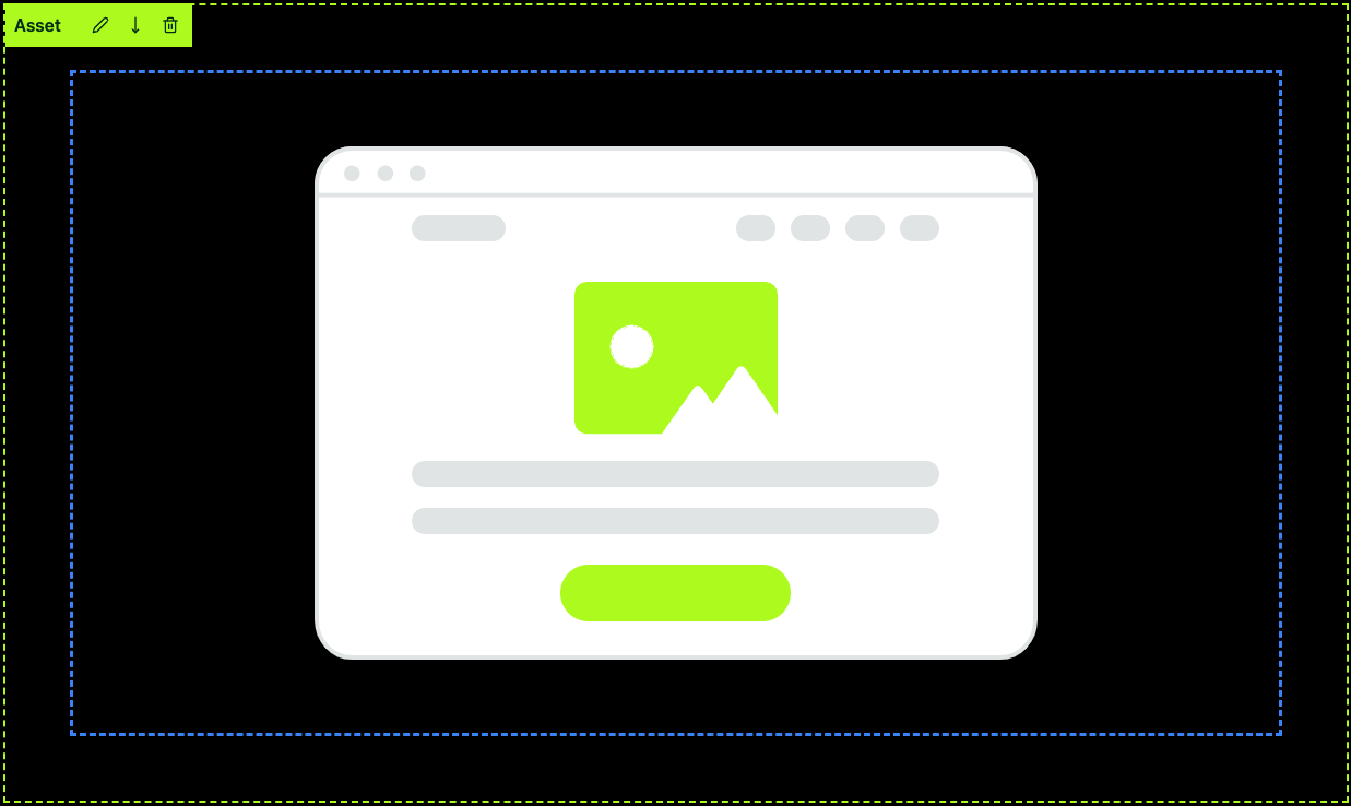
1️⃣ Added a new component for displaying only photos.
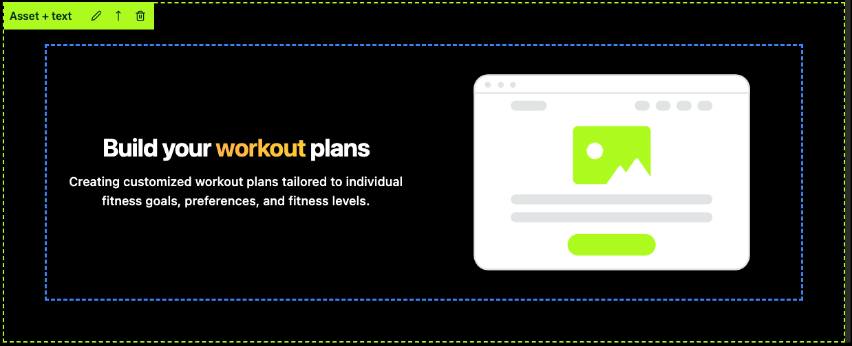
2️⃣ Added a new component for displaying photos with text.
- The order can be changed to display the photo first and then the text.
- Vertical alignment can be set.
🐛 Bug fixes:
✅ Fixed the issue with uploading large photos